Modern brand identity for trusted audit, tax, and business advisory services.

Client

Ebin Kurian & Associates

Industry

Finance, Legal, Tax Advisory

Location & Branches

Kerala, India

Overview

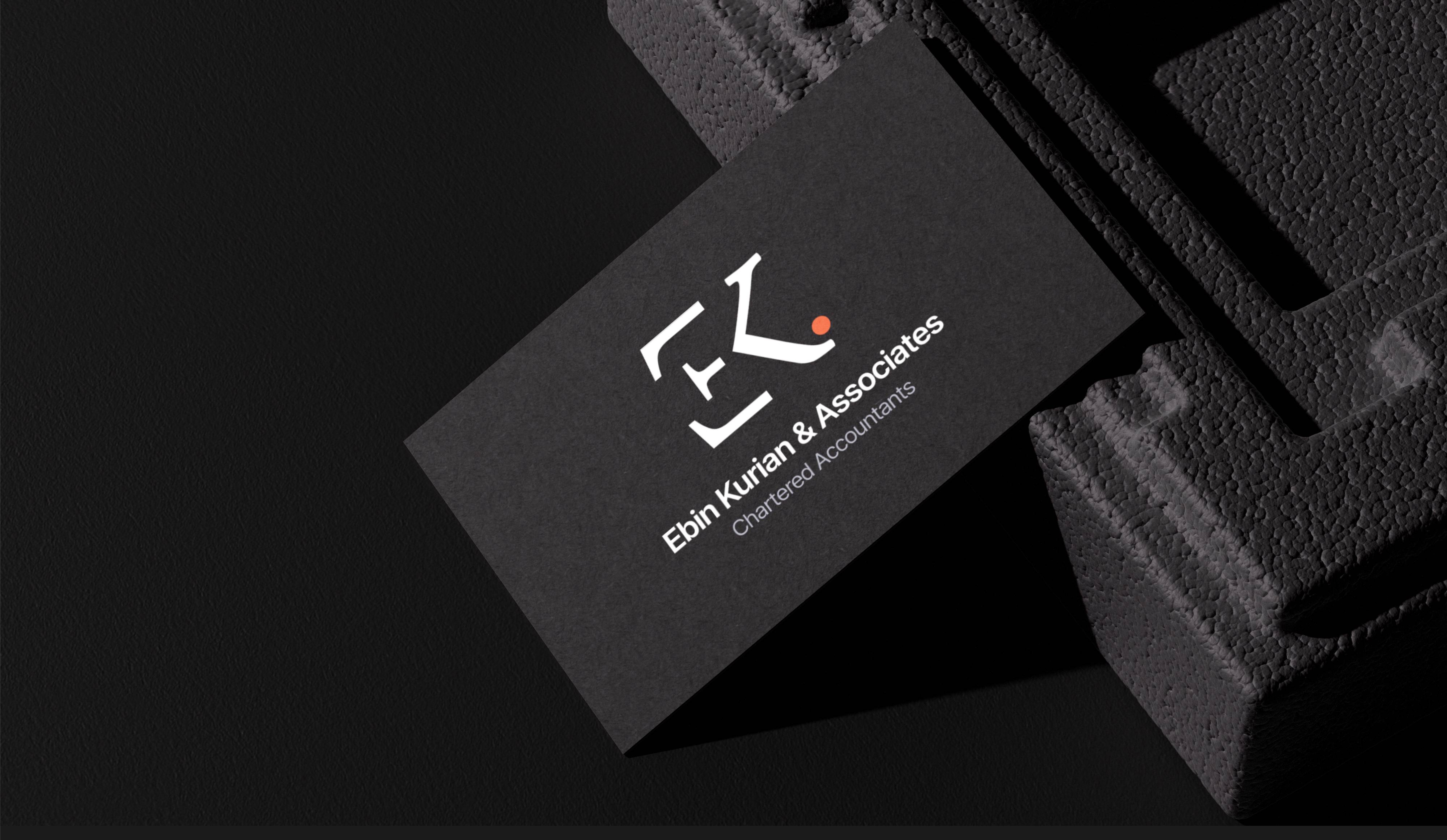
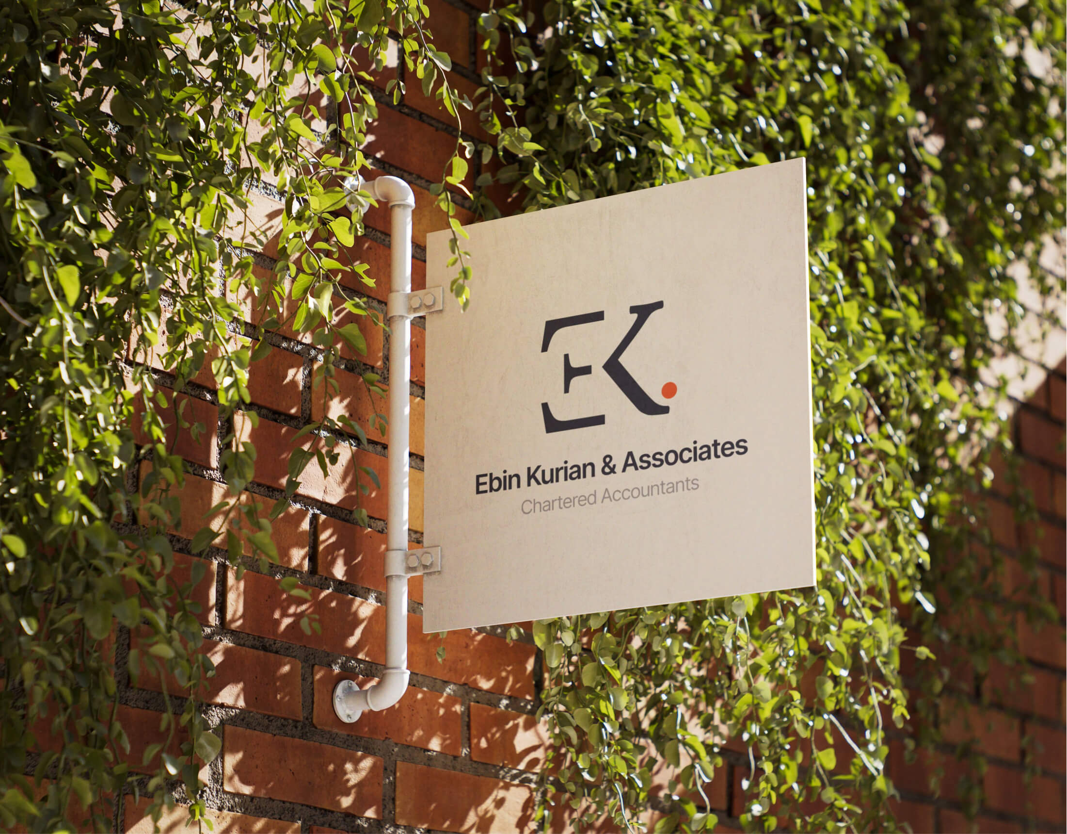
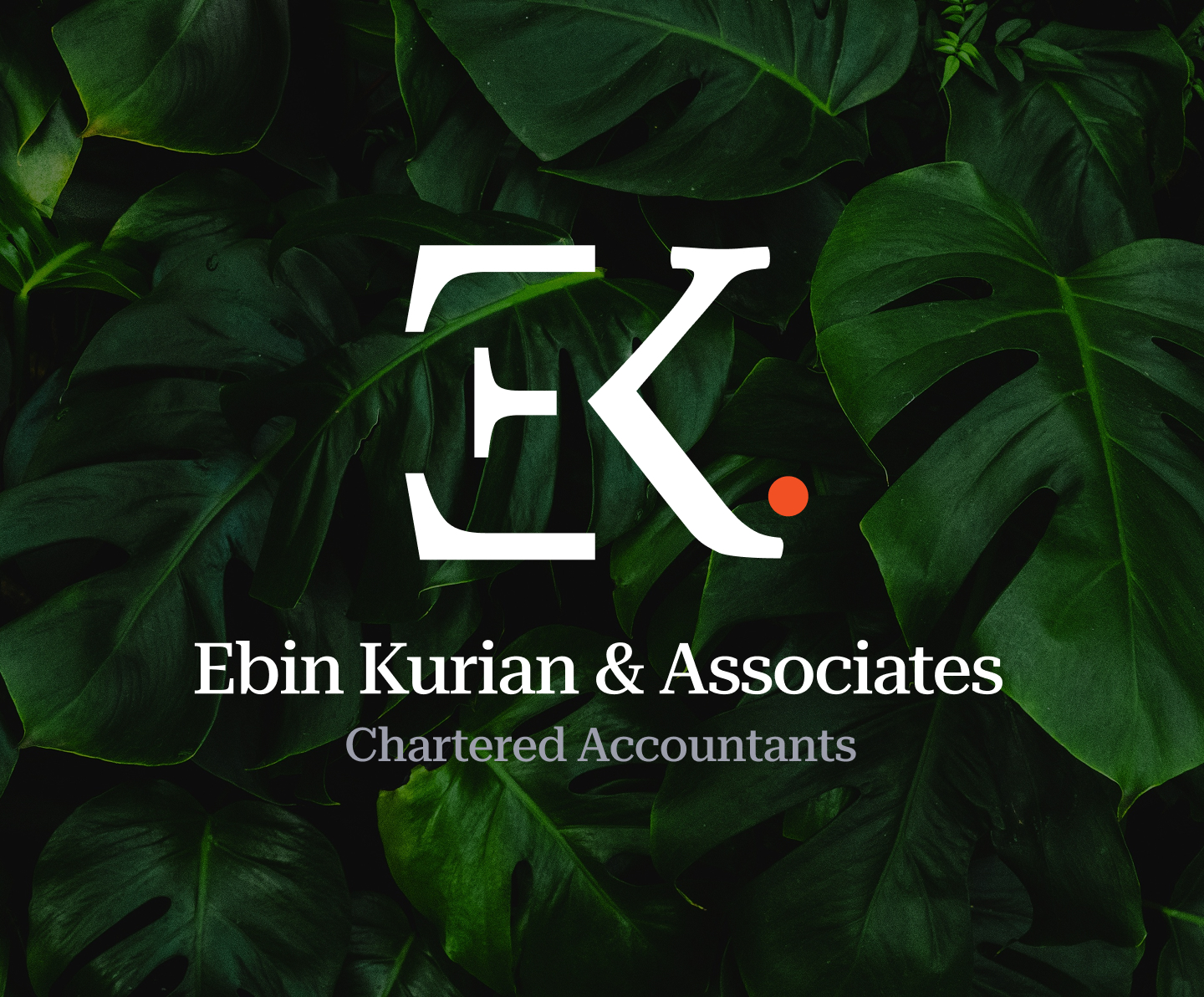
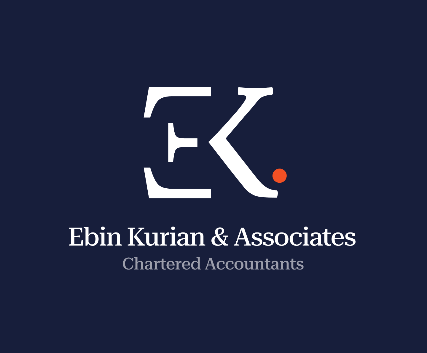
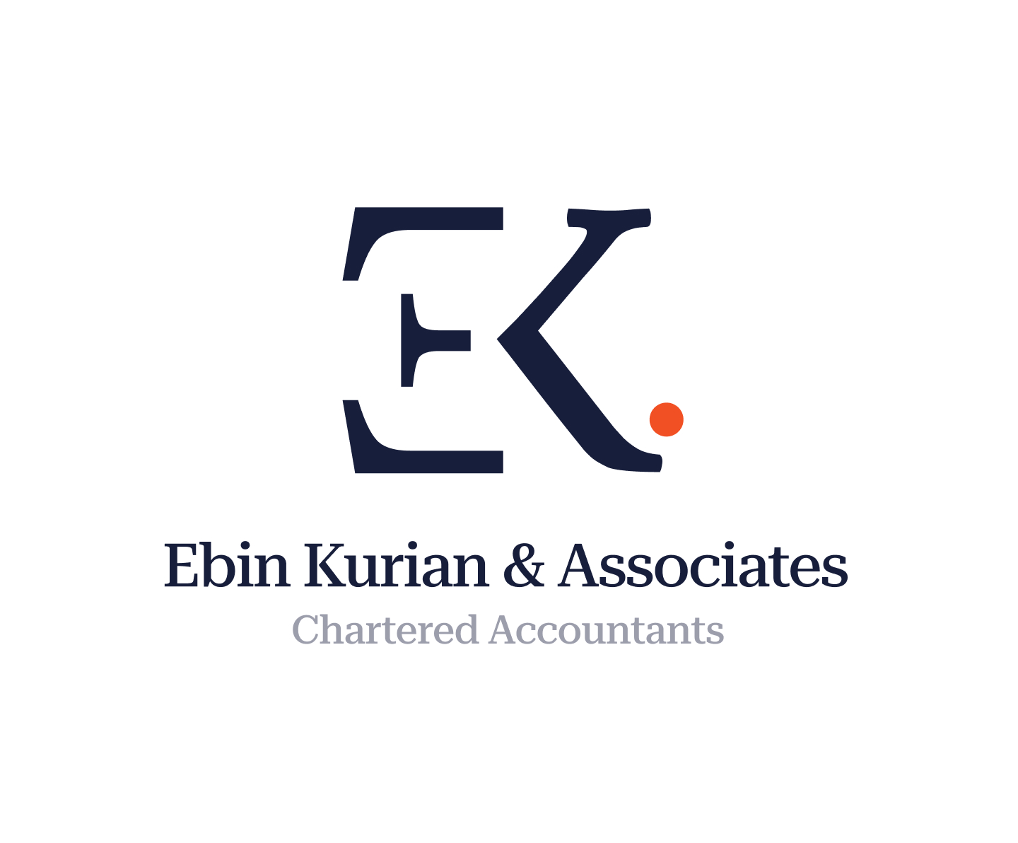
Ebin Kurian & Associates is a team of chartered accountants offering services such as statutory audits, internal audits, GST advisory, income tax filing, business setup, and management consultancy. The objective of this project was to create a distinct and professional brand identity with a modern logo system that communicates trust, credibility, and financial precision.

Stakeholder Interviews

Q : What is the purpose of creating a new brand identity?

A : To establish a clear and professional brand presence that represents the firm accurately.

Q : What type of image should the brand project?

A : A trustworthy, professional, and modern image suitable for a financial and advisory firm.

Q : Who is the target audience for this brand?

A : Business owners, professionals, and individuals looking for reliable audit, tax, and advisory services.

Q : Where will the brand identity be used?

A : On official documents, visiting cards, reports, signage, and digital platforms.

Q : Are there any preferences or constraints to consider?

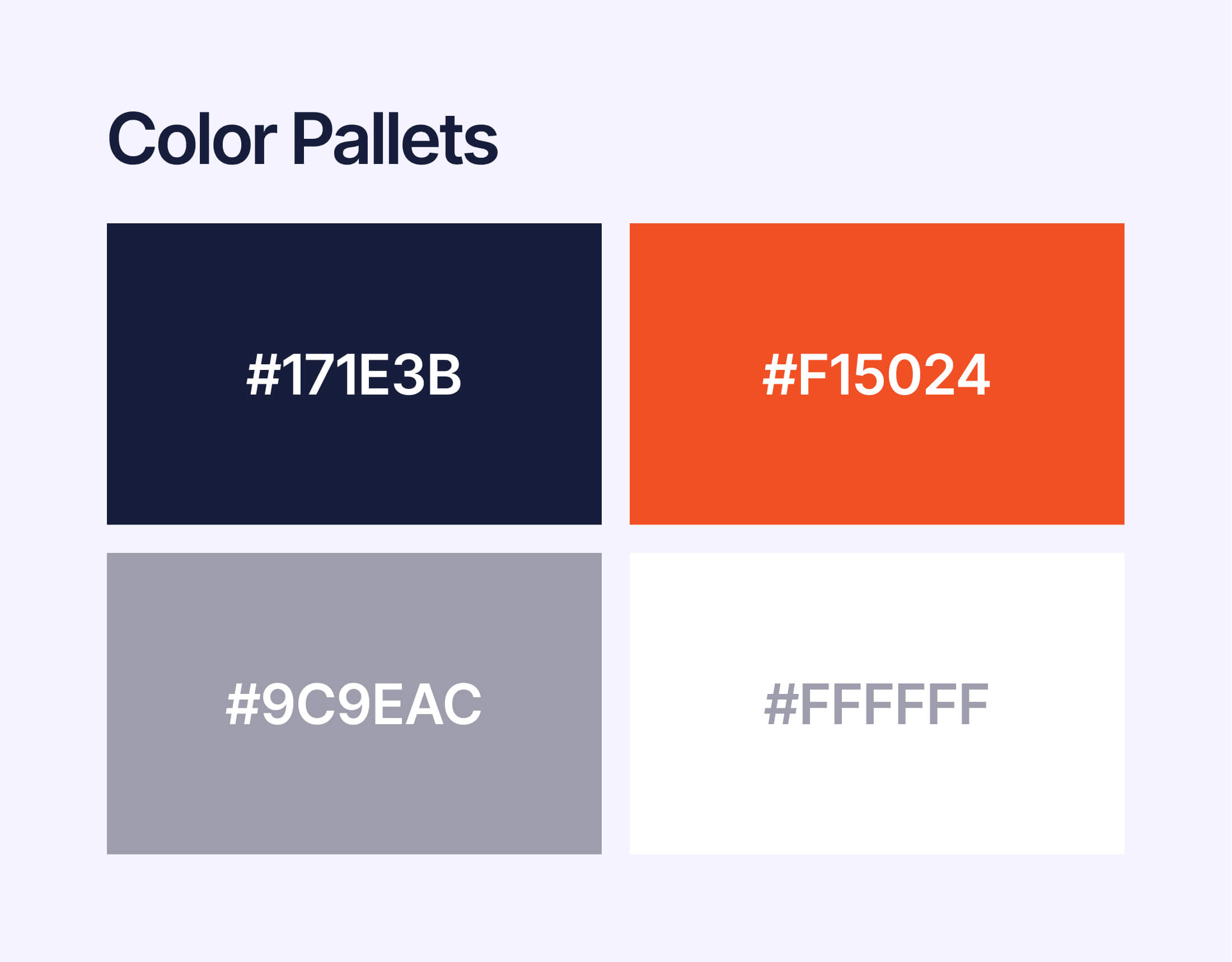
A : The identity should remain simple, professional, and easy to apply across different mediums.

Requirements

Brand Research Logo Design Visual Guidelines
towr-UI

BRAND CONCEPT

Ebin Kurian & Associates needed a strong and clear identity that reflects expertise in finance, legal, and tax services. I created a custom monogram using the initials “EK”, making the brand recognizable and unique.

The geometric structure of the logo gives it a solid and dependable appearance, reinforcing professionalism and trust. A subtle red dot was added as a meaningful accent, representing accuracy, focus, and attention to detail key values in financial advisory services.

USER RESEARCH & INSIGHTS

Insights that shaped a minimal, trustworthy brand identity

Industry research and competitor analysis showed the need for a minimal yet distinctive identity. The brand needed to feel modern, reliable, and professional, without unnecessary visual elements.

  • Simplicity helps build trust in financial services.
  • Strong typography improves clarity and credibility.
  • Limited color usage keeps the identity sharp and professional.
  • The logo must scale well across documents, signage, and digital platforms.

DESIGN PROCESS

Balancing Creativity with Consistency in Design

The process began with research and concept sketches, followed by multiple logo explorations. Each concept was evaluated for balance, clarity, and real-world usability, such as business cards, reports, and official documents.

After finalizing the logo, a complete brand identity system was developed, including color palette, typography, and layout rules to ensure consistency across all touchpoints.